
Roblox
UX/UI, Branding, Strategy
Since the company's inception in 2009, the product's codebase and design had not undergone any significant upgrades, and its user growth had plateaued.
Our goal was to make the product more accessible; we expanded the product line to include browser and mobile offerings—a significant challenge since the legacy product was dense with complex features—so we sought to create an intuitive interface that wasn’t cognitively overwhelming.
Interaction design spec for the chat feature on the desktop web browser
I was the Lead Product Designer at IMVU, where I led the product strategy and design of the next generation desktop and mobile virtual 3D platform, resulting in increasing our monthly active users by 500% (from 1 million to 5 million) and doubling our net revenue in a two year span.
Porting Complex Features to Mobile
New users were required download a client application onto a PC; it was a huge source of friction as it required significant investment and trust in an unknown product.
We strategized to move the product into the mobile space, and to utilize WebGL to port the product into a browser experience.
User Falloff in Sign-Up Funnel
The value proposition was vague, the interface was demonstratively unintuitive and contained a lot of dead ends. Something as simple as creating a username for their account would frustrate a user into quitting, as their input would be denied without explanations or suggestions.
Weak product loop
The product as a whole was fragmented: shopping and socializing were core features of the product but the correlation between them was weak.
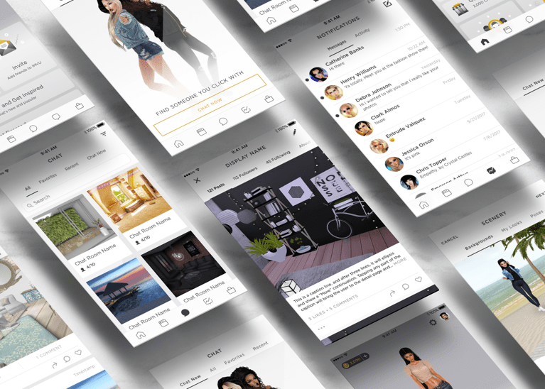
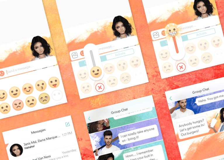
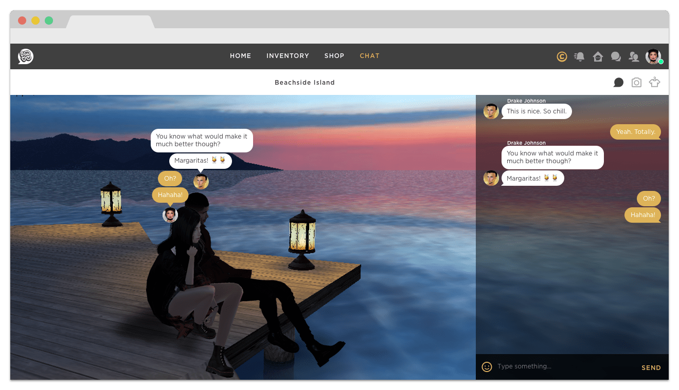
One of IMVU's core features, virtual chat, was in desperate need of an UX overhaul. I was responsible for designing end-to-end flows, including: onboarding, 3D navigation, group and single messaging, emotes, sharing and invitations, photo-taking, and many more.
Live capture of the chat feature I designed and shipped for the iOS app
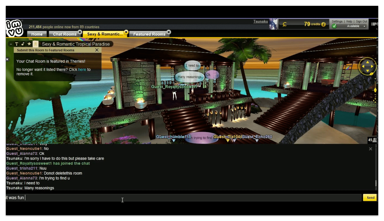
Drag toggle to view: The old desktop experience in 2014 (left) and the 2017 redesign (right)
In reimagining this feature, we took a holistic approach to the challenges we faced. The first thing we needed to do was consolidate and establish commonalites in usage and information architecture.
IMVU offers an immersive social experience by means of a 3D scene (immersion) and a chat interface (social). Both features are naturally dense with interaction, and given mobile's small real estate, often vie for focus.
The solution was not to force the chat interface and the 3D environment to share the spotlight, but instead to create focused and minimized states in which they alternate with each other. On larger screen sizes, both interfaces have enough room to be present.
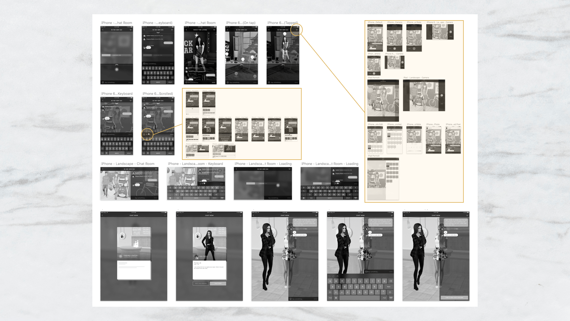
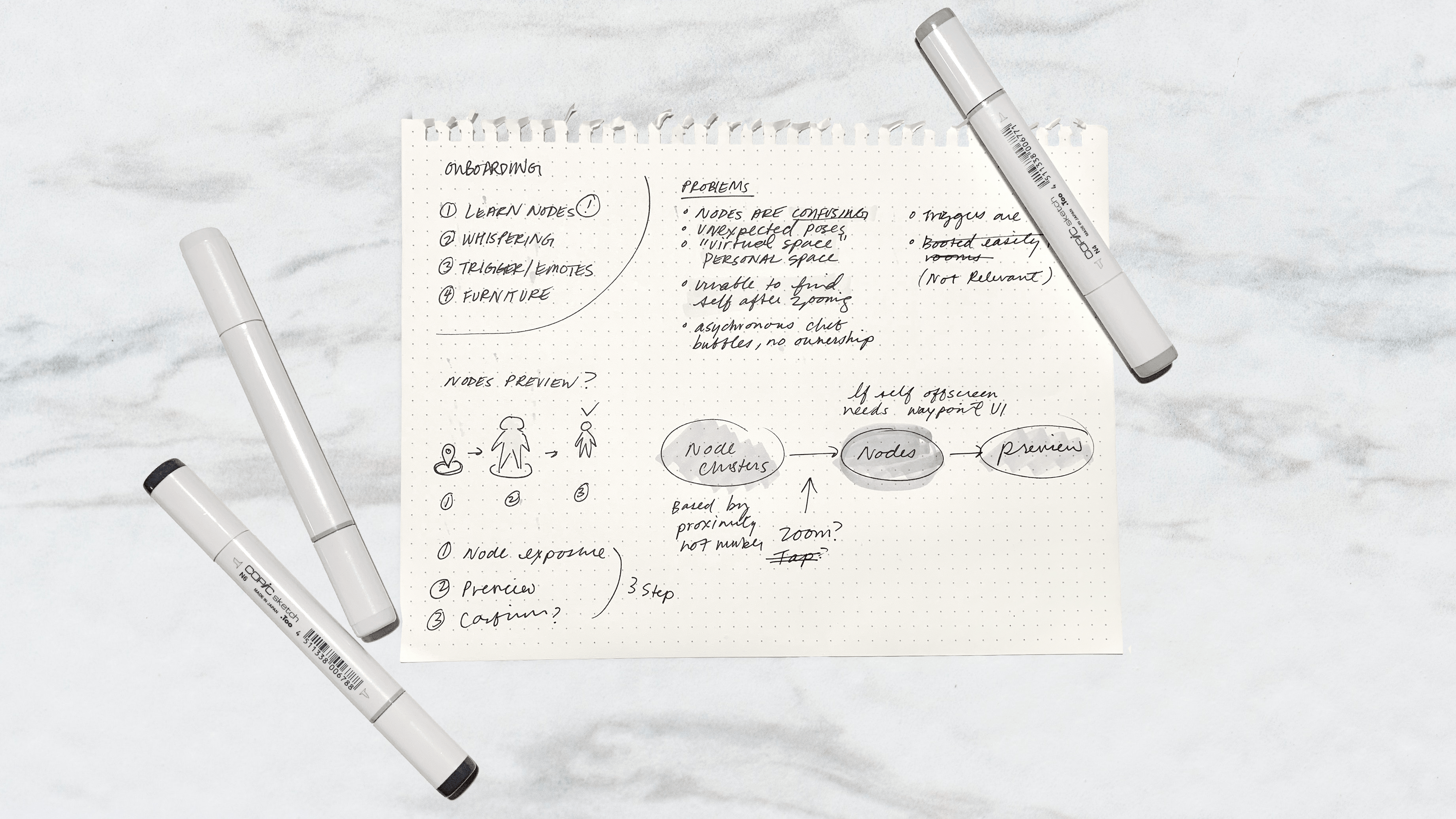
Wireframes for loading, 3D navigation, emotes, and photo-taking flows (for phone and tablet)
I strove to create an appealing and flexible design system that would attract new users but not alienate the established user base.
Our user personas were generally young adults with a sense of fashion and a flair for status, and seeked a product that would allow them to attain or express those values. I created a set of design principles around these ideals, and crafted our visual components to exude youth culture and luxurious living.
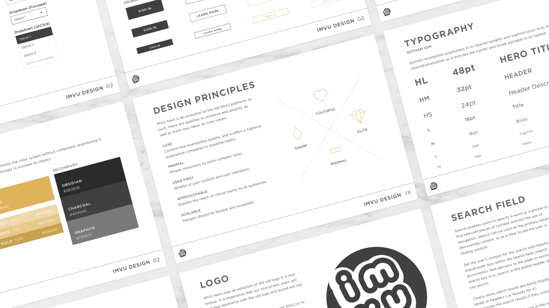
IMVU Design language ties the product and the brand together with a single design system, which includes typography, color, and UI components
In an effort to evolutionize the old design palette, I kept the yellow accent color, but toned it to gold, and lightened the overall color scheme to achieve a minimalistic and contemporary look.
Minimalism was a deliberate design decision on my part; I wanted to take advantage of the heavily visual 3D scenery and make UI feel immersed and integrated with the worldbuilding.
Defining the architecture and a flexible layout that could work in any configuration (i.e. desktop, tablet, mobile, in both portrait and landscape orientations) was important; it heavily established usage patterns and information hierarchy, and allowed future features to be easily ported to smaller form factors.
I designed a robust system in which the UI layer and 3D scene could cohabit on larger screens, and alternate in focus on smaller devices.
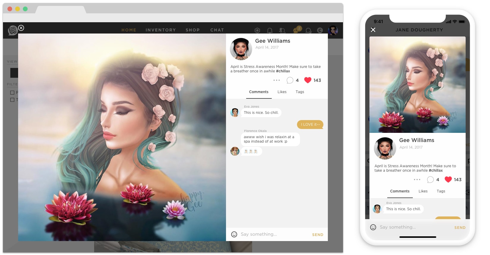
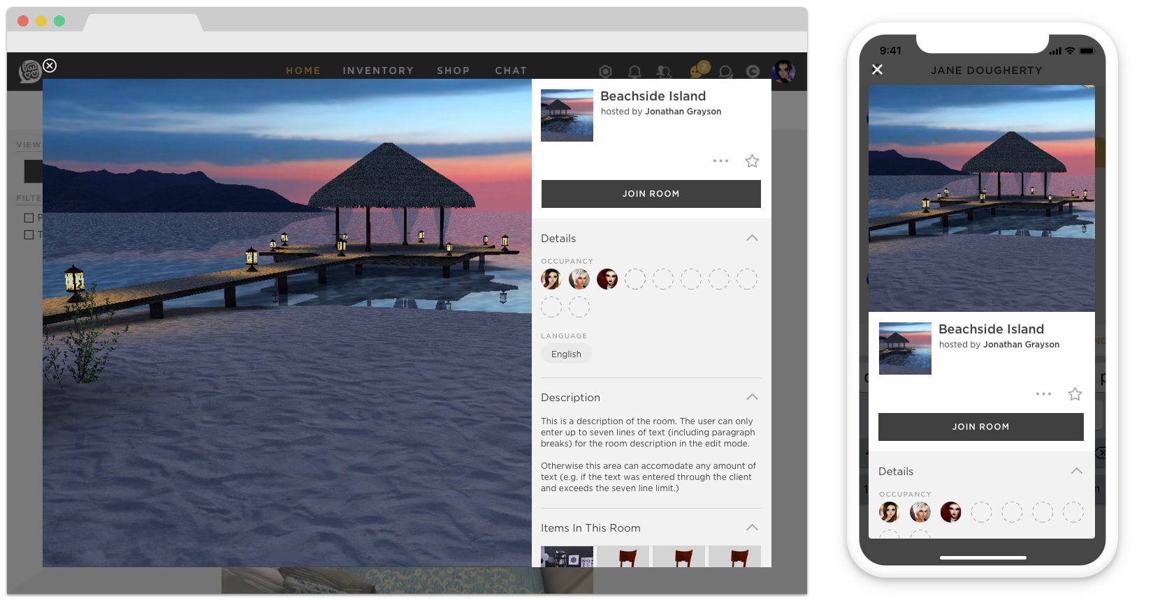
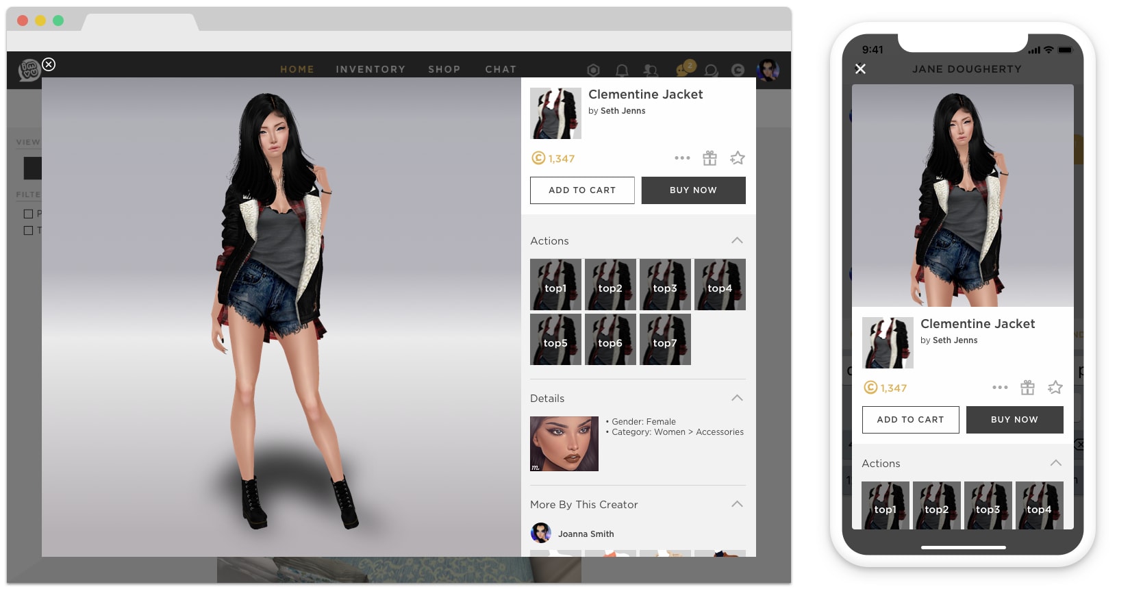
Having established a scalable layout, it allowed for us to design a contextual card component, which meant that content and information was easily portable and accessible. Users had access to information that was contextual to their whereabouts. It was easier to make friends with people you met in the virtual world, share interesting places and things, and much more convenient to buy compelling merchandise you found in the wild.
Interaction prototype of the card component in a compact format
Live capture of the card component I designed and shipped for large formats (i.e. desktops, tablets)
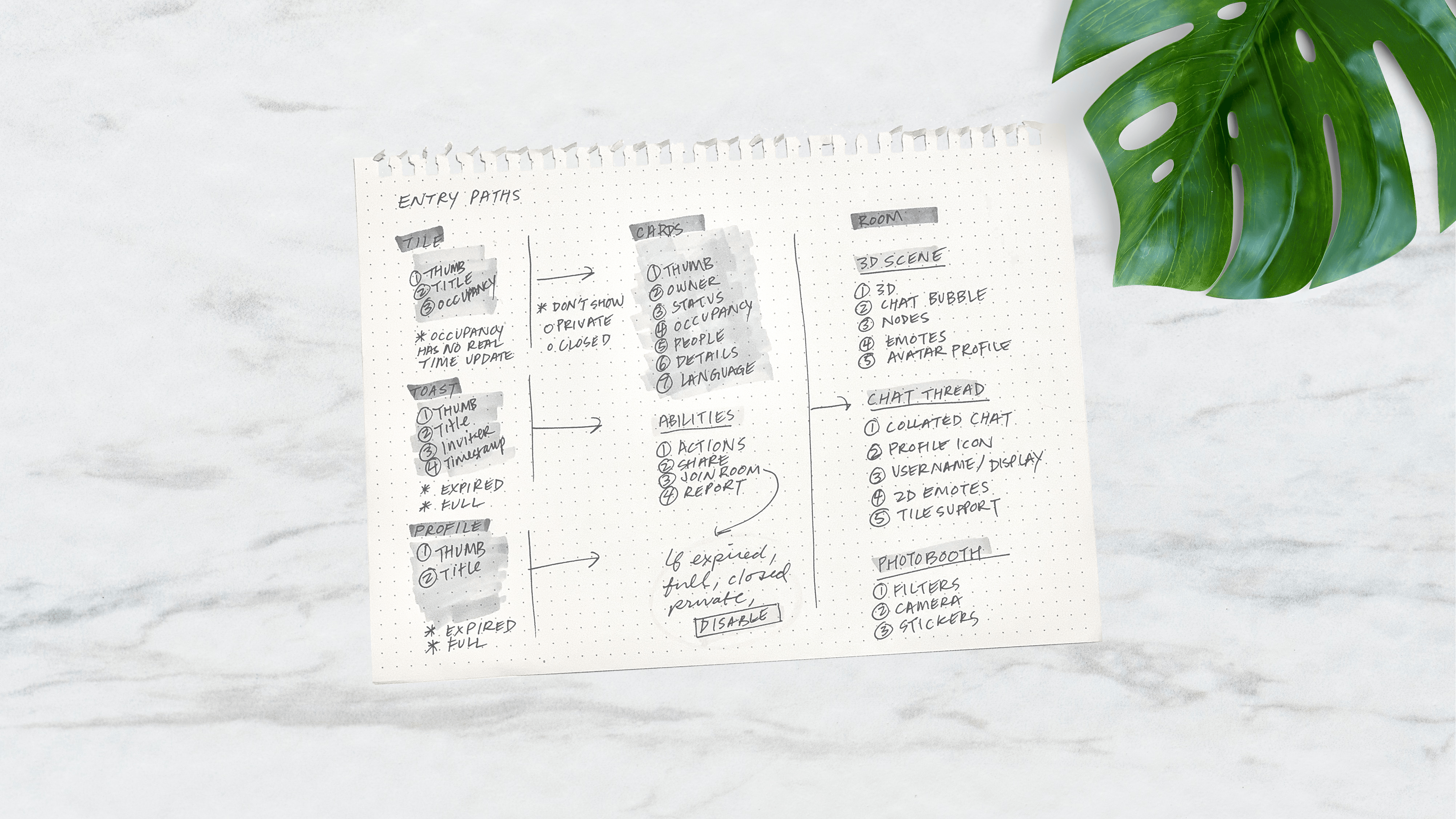
Figma file of high-fidelity wireframes detailing flow, edge-cases and the information architecture of card system
A new user had to overcome immense hurdles before they could participate in something meaningful, and the numbers were dismal as a result (less than 7% of users were successful in engaging their first chat after clicking an advertisement).
The legacy experience featured a landing page that inadequately demonstrated product value, a convoluted sign-up process with an antiquated username scheme, a required download of an 80MB client, and last but not least, shackled the user with an unappealing starter avatar that had limited customization options, which ostracized them from established community.
Live capture of the new FTUX and onboarding experience I designed and shipped for the iOS app
Data revealed that the highest drop-off happened at the required download of the client, and user testing confirmed that there was not enough established trust or knowledge of the product value to do so.
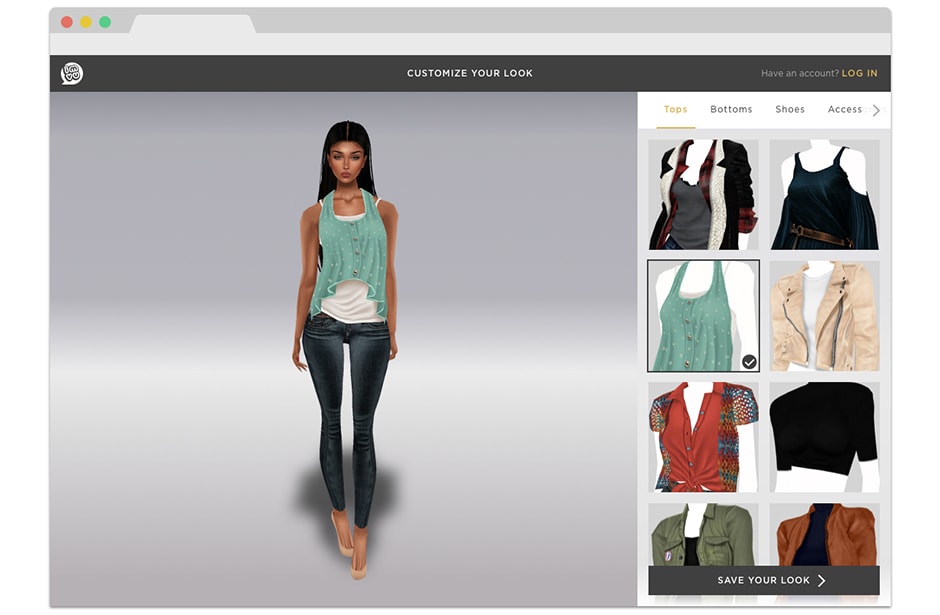
We approached the problem with a couple of strategies: move (and improve) the avatar customization experience upfront before the sign-up process, make the product available and performant in web browsers (and offer mobile app experiences), as well as update and improve the username schema.
Adaptation of above design in a desktop web browser format
With the customization step at the beginning of the sign-up flow, it meant that new users will form their first impressions of the product through this feature. It needed to be extremely intuitive as well as establish their expectations of the interaction model for the platform.
I applied the same layout and grid system I've established for the chat feature to reinforce the usage pattern. The categories was reorganized and proper hierarchies were established, the language was made more semantic. The registration form was simplified, and backend endpoints were retooled to allow users to easily create an account with a non-unique username, circumventing constant dead-ends and errors that was present in the old form.
This resulted in the raising the number of users completing the registration funnel from 7% to 64%.